Prototyping an Onboarding Flow That Actually Converts

Organisation
Stackwise app
Role
Designer
Duration
6 Weeks
Tools & Technologies
Figma
Framer
Maze
Problem
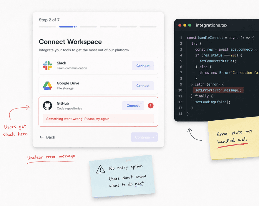
Stackwise had an onboarding flow that was bleeding users before they ever saw the core product. 60% of new signups were dropping off at step two. The team had tried copy changes and button colour tests but nothing moved the number. The problem wasn't the words or the colours — it was the flow itself. Too many steps, too much asked too early, and zero sense of progress for the user.

My role
I owned the full UX redesign — user research, flow mapping, high-fidelity prototyping in Framer, micro-interaction design, and working with the engineering team to spec every interaction for production.
Outcome
Onboarding completion rate went from 38% to 84% in 4 weeks of launch
How i solved it
I started where the data was — session recordings of 40 users going through the existing onboarding. Watched where they hesitated, where they scrolled back up, where they closed the tab. The pattern was clear. Step two asked users to connect three integrations before they had any idea why they should care.
You can't ask for commitment before you've shown value. The flow was asking people to invest before they understood what they were investing in.
I restructured the entire flow around a single principle — show the product working before asking for anything. Moved the value demonstration to step one. Made the integrations optional and movable to after activation. Reduced the mandatory steps from 7 to 3. Then prototyped every micro-interaction in Framer — progress indicators, step transitions, success states, error handling. Every state accounted for before a single line of production code was written. The engineering team had a prototype they could interact with instead of a Figma file they had to interpret.


What shipped
A completely rebuilt onboarding flow — 3 mandatory steps instead of 7, a value demonstration before any integration requests, and smooth transitions between every state.
The prototype was so close to production that engineering said it was the smoothest handoff they'd ever had.
Onboarding completion rate went from 38% to 84% within 4 weeks of the new flow going live. The team also reported a significant drop in support tickets about setup confusion in the first two weeks post-launch.
What worked
Watching session recordings before redesigning — showed the real problem instantly, no guessing. Prototyping every state in Framer — engineering had zero ambiguity during build. Moving value demonstration to step one — the single biggest lever on completion rate.
What I'd Do Differently
Test the prototype with real users before handing to engineering — caught one confusing step only after launch. Set up a more granular funnel tracking from day one to measure each step individually. Explore a more personalised onboarding path for different user types earlier in the process.
// Other works
Have a look at my other work

Building a Perfect Design System from Zero
4 Months
2026
Joined the team when every single screen was built in complete isolation and there is no tokens, no components, no consistency.

Lumio
Designer

Redesigning the Core Dashboard of saas product
3 month
2024
The old dashboard had 11 years of visual debt. I stripped it back, rebuilt every component in React, and shipped a version that cut user drop-off by 40%.

Trackflow HQ
Frontend + designer




@zolt Mercer 2026