Redesigning the Core Dashboard of saas product

Organisation
Trackflow HQ
Role
Frontend + designer
Duration
3 month
Tools & Technologies
Next.js
React
Framer
Problem
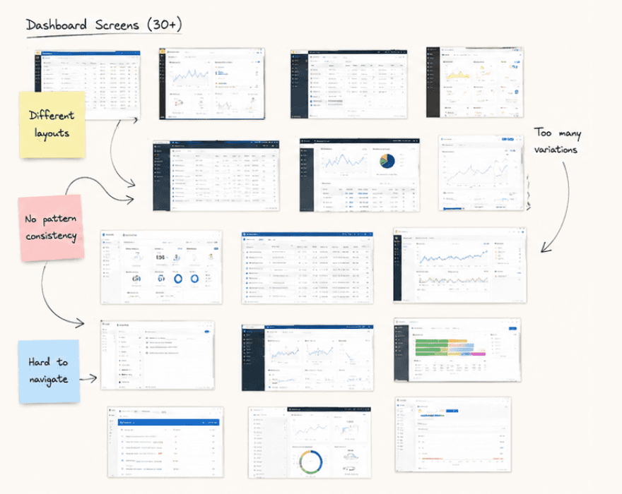
The dashboard had 11 years of visual debt — 30+ screens built by different people with no shared system. Users were dropping off at the core workflow screen at a 60% rate. Three different teams had built UI in completely different ways and nobody owned the problem.

My role
I led the full redesign — user research, information architecture, visual design, and frontend implementation in Next.js. Worked directly with the CTO and two engineers throughout.
Outcome
User drop-off reduced from 60% to 22% within 6 weeks of launch
How i solved it
The first thing I did was talk to users — 8 interviews in the first week. Not about what they wanted the dashboard to look like. About what they were actually trying to do every day and where they kept getting stuck. The answers were consistent and painful. Nobody could find anything. The navigation was built around the company's internal team structure, not around what users needed to accomplish. I redesigned the information architecture before touching a single visual. Grouped every feature by user job-to-be-done. That structural change alone solved more than half the confusion before any visual work started.
We didn't have a design problem. We had a structure problem wearing a design problem's clothes.
Then came the visual layer — a clean component system built in parallel between Figma and Next.js using feature flags so we could ship incrementally. Each section went live separately. We measured drop-off at every step. The data told us what was working before we committed to the full release.

What shipped
What shipped was a completely rebuilt dashboard — cleaner information hierarchy, 40% fewer clicks to reach core actions, and a consistent component system the engineering team now builds on top of.
The thing that surprised the team most was how fast adoption happened — because we shipped incrementally, there was no big scary cutover.
The feature flag approach meant users were already familiar with most of the new UI before the full switch. Drop-off at the core workflow screen went from 60% to 22% within 6 weeks of launch.
What worked
Shipping with feature flags — measuring impact at each step gave the whole team confidence. Starting with IA before visuals — solving structure first made every design decision faster and cheaper. Pairing with an engineer from day one — nothing got lost between design and build.
What I'd Do Differently
Run usability tests during the process not just at the end — caught some issues later than I should have. Document design decisions more thoroughly for whoever maintains it after me. Push for a design system conversation earlier — some inconsistency still remains.
// Other works
Have a look at my other work

Building a Perfect Design System from Zero
4 Months
2026
Joined the team when every single screen was built in complete isolation and there is no tokens, no components, no consistency.

Lumio
Designer

launching a Marketing Site in 5 Days
1 Week
2025
Startup needed a launch site before their funding announcement. I designed and built the entire thing in Framer — live in 5 days, no handoff needed.

Orion Labs
Design engineer




@zolt Mercer 2026